Sunday, November 25, 2012

Lip Love: L'Oreal Fairest Nude

Hey! Just a quick, quick blog post about my newest favorite lipstick. I usually go for nude pinks as opposed to a more truer nude but I have been on the hunt for a nice one that isn't too dark for someone as fair as me. With Fairest Nude I think I found a keeper! 


It is a true nude. No pink undertone, which is a nice change. It's not too light and doesn't white out my lips like some I have tried (no concealer lips!). Even though I like some nudes to be a little bit lighter in contrast to my skin tone, this one doesn't have that quality. Which is a nice change! It was what I have been looking for! I also run into the problem where I find a gorgeous true nude on different blogs, then when I go to try it out, it is way too dark for my skin tone. That, I hate. 

The L'Oreal Colour Riche lipstick line smells really similar to baby powder. That's not my favorite scent in the world, but I can deal with it because Fairest Nude is a great color. It is a cream finish. It's not drying, & there isn't any kind of shimmer in it. Just like any other lipstick, your going to have to re-apply it through out the day. 

If your really fair (like me!) and your looking for a straight up nude, I think you should check this out! I have been loving it!

What's your favorite nude lipstick? I would love to check them out! You can never have too many lipsticks! haha!

That's it!
xoxo
Erica


Monday, November 19, 2012

Dollar Tree Finds!

I always forget about Dollar Tree. I remember when I was a little girl my Grandma would let my cousin Kelly and I go in and pick 1 toy after our picnic at the park every week. We always used to get the brown lunch box bag labeled "grab bag" or "surprise bag" or something. Then we would be upset because the toy sucked. Dammit.

Donna Michelle Nail Art
How fun are these? 8 mini bottles come in 1 pack. Thinking back, I maybe should have bought 2 packs of the same designs because these mini bottles look like they would maybe be enough for 1 hand- only some of them though. Not every bottle has the exact same amount as the next. Some are filled to the brim and others look like it may be enough for just 1 finger nail. I think I will just do my bling finger with them.  I was surprised to find out that the little bottles they came in weren't flimsy. I think they might be glass. If not, it's that plastic that feels like glass. I got 3 different packs: 1 with caviar beads, 1 with flakies, & 1 with little shapes (stars, hearts). Im looking forward to messing with these.


L.A. Colors in Bronze Glow
This might be the best deal at the Dollar Tree. I initially got it because I have been on this bronzed highlight kick. Since this was more of a medium golden color with shimmer, I figured it might make a better highlight than bronzer. I am fair-medium skin tone, leaning more toward fair. I think I will need to wait for the summer to make it look right. If your a little darker (medium) than me, you could pull it off better than me. The pigmentation is pretty good and because of that & the color it gives off really makes a beautiful eyeshadow! I have worn it a couple times on my eyes so far and I am happy with it. Looks really pretty on my lid over top Barely Beige 


What I even went in for in the first place was some tea lights and to see if they had a medium brown hair dye I could use on one piece of hair that I highlighted too close to the root and really needed to be fixed! To my surprise, they actually did! I was a little nervous using my $1 hair dye but since it was just 1 piece of hair, I really didn't wanna buy a name brand hair dye for $7 to throw almost all of it out. And guess what, guys? It actually wasn't a bad hair dye! If your in a bind, tight for money, your roots are growing in, or you messed up some highlighted pieces (oops!), check it out! Not a bad deal at all. I was really, really surprised!


I think I am going to have to go back in a couple weeks and grab some stuff for my stocking stuffers for my family, friends, and you guys! I am having a Christmas giveaway here! Soon, soon!


Any good stuff you have found at the Dollar Tree recently?

xx,
Erica 

Friday, November 16, 2012

Fall Fashion 411 - Fall Trends Series 2012. Part 1

Remember my Fall Trends Series from 2011? Well! That took a lot of work and even though it was so much fun it was also tedious but I found that lots of people actually liked it & it was actually helpful. I already started hunting for new pieces of clothing for this year's trend series but I am not positive if im in it for the long haul. If that is something you would like to see, please let me know! If not, then it's going out the window! Plus, I am a little late on that anyways.

Think of this as a Fall Trend Series extension for 2012. As of the last 2 months or so, I did some damage with new clothes. One of the things I purchased from American Eagle while they were having their $30 jeans sale was a rhapsody colored pair of pants. Since Rhapsody is one of the Fall colors for 2012 on the Pantone color panel, I want to give you ideas on how to wear colored pants in a stylish way. You will be surprised at how many outfits you can make out of 1 pair of colored pants.

This blog post will be, for the most part, my humble opinion on ways to wear different colors and prints together.  In college, I took a fashion history class. Some of the things I learned in that class will be here too. Here are some easy guidelines to follow on ways to put a flattering outfit together in what you might think are surprising ways. I really hope a light bulb will go off in your head and you venture out into mixing colors & prints this season!


Exhibit A
Mixing a Color with a Neutral Print
Quite possibly the easiest one to figure out. Instead of wearing a colored shirt, go with a neutral print to match your colored jeans/pants. I like this because it is trendy without being too loud. You have your bird print (trendy!) with a peter pan collar (also trendy!) in black and cream.

JC Penney's top was $9!


Exhibit B
Mixing colors.
The easiest one in my opinion to feel like it doesn't fit. A basic rule of thumb to use when mixing colors: does it look appealing to you? If so, then your good! If you want more inspiration, here's a couple more tips:

#1. Pantone Color Panel:  
The rule of thumb on any color panel is that every single color on the panel goes with every other color. Click to see Pantone's Fall 2012 Color Panel.

#2. Use the exact same color in different hues 
Monochromatic color scheme 
ex: light purple with bright purple*

#3. Use the exact same hue of different colors  
ex: deep purple with deep orange*

#4. Using a Primary Color Scheme 

Blue, Red and Yellow are the primary colors. All three look good in the same outfit*

#5. Using a Secondary Color Scheme 
Same as primary colors, secondary colors pair great in an outfit. You could use all three: Orange, Green, & Purple.*

#6. Using a Triad Color Scheme 

As easy as it sounds. Look to the color wheel. Which colors make a triangle in the wheel? You notice that both the primary colors and the secondary colors are in a triangle formation on the color wheel. This trick can be used with any colors on the color wheel. 
ex: pink, green, & brown create a triad color scheme.*

#7. Using a Complementary Color Scheme 
Whatever color is right across from your color is complementary of it. 
ex: green and red are complementary.*

#8. Using an Analogous Color Scheme 
Refer to the color wheel. Find your color. Either color next to it make all 3 analogous color. You can also split the color wheel into two parts and think of it as being warm colors (yellow through red) vs. cool colors (purple through green). With analogous color's, they could mix both warm and cool colors as well, overlapping each other. ex: your color is pink. Pink will go perfectly with blue and purple.*

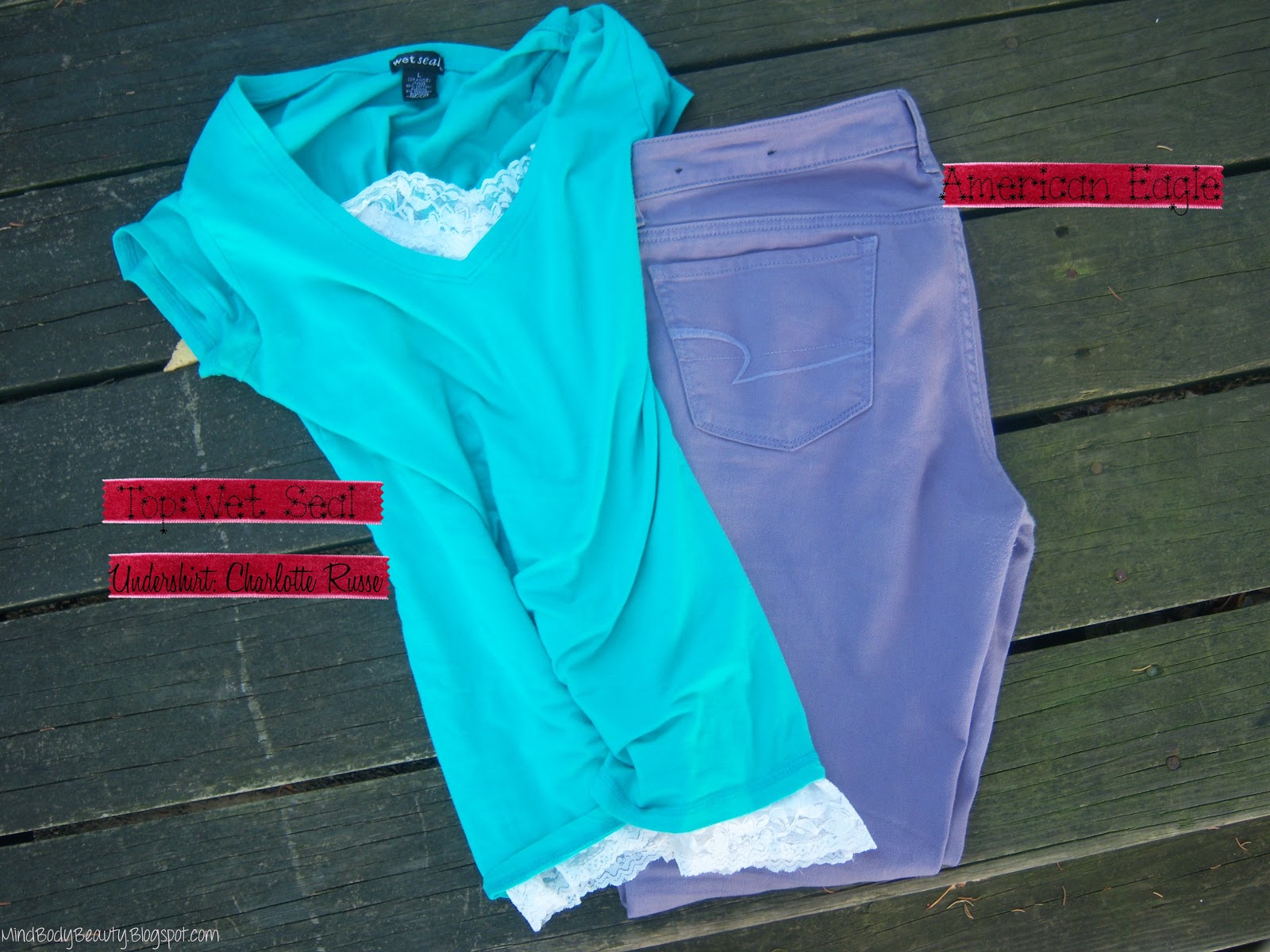
My outfit would fall under the analogous color scheme. Both colors are next to each other on the color wheel. Just because they aren't the same hue or color doesn't mean they don't fit! I think the white undershirt makes the outfit a little brighter, but I also sometimes wear this with a dark purple undershirt. Another great idea would be to go with any blue colored undershirt.
  If your looking to try this out, check out Wet Seal. They have basic tops, & tank tops in all different colors and some cute neutral prints. all 5 for only $20!


Exhibit C
Mixing 2 Colors with Prints

 Step #1. Choose your color. 
Mine is the color Rhapsody in the jeans.

#2. Choose a print: 
The same rule with mixing different colors. Mix different colors with the same hue-or- mix the same color with a different hue, 1 being a solid color and 1 being a print. I am choosing my leopard print scarf and that is a different color with the same muted, soft hue. The color of the scarf is called Rose Smoke, also from the Pantone Color Panel.

#3. Choose another print in the same print
You can omit this if you feel what you have is enough. If not, choosing a second print is as easy as pie. An example of what I mean by another print in the same print is this. Say your print is leopard (as mine is), find another article with a different leopard print on it, as I did with my leopard scarf and undershirt. They are both leopard print but not exact replica's of each other. In my opinion it adds interest without being too tacky

If your going with a second print, be sure not to over do with. I think the scarf going along with the undershirt isn't as loud as a blouse with a scarf, both being prints. It's too much in my opinion. A subtle pop of print here and there is nice. Another cute idea to add your print of choice would be in a leopard bow on a neutral pair of shoes.


#4 Complete the outfit:

I have a Titanium (a grey color) V-neck which completes the outfit. At this point, it's best to find some flattering neutral pieces to complete the outfit. Adding another print or color might not be in good taste so this, to me, is perfect. 


With these "rules", the possibilities seem endless

So, Class!

How have you been mixing it up with your clothing lately?
Whats your favorite outfit in this post?
Whats your least favorite?
Is there anything else you would have done different?

disclaimer: Almost all of these "rules" are my opinion. I am not a professional. I did however take a fashion history class in college and did quite well! Some of these rules are what I learned in the class. They will be marked with an*. Basically, anything you read in exhibit B I learned in college.

Happy Mixing,
Erica

Sunday, November 11, 2012

Glitter + Matte = Confetti

So lately, I have been adding my Hard Candy Matte Top Coat on top of every single polish I own. I have tried it over cream finishes (nice), duo chrome finishes (really cool), white polishes (don't recommend it unless your going for that white-out look) & my favorite would probably be glitter polishes. I was inspired to buy it from all of my favorite nail bloggers. They always use glitter underneath a top coat and it always looks so freaking cool. It looks like confetti. It still has a little bit of a shine to it, but you can see the colors in the glitter more vibrantly as opposed to seeing the sparkle. I have had people ask me "how did you do that?!" Of course I will always love my glitter polishes with a normal top coat, but if your like me and you have lots of different nail polishes with limited amount of finishes (cream, duo chrome, cream w/flex of glitter, and glitter) the matte top coat is really a fun way to mix it up. And by the way, my nails aren't in the best shape, but I just had to share this!


The glitter is called Rockstar Pink and it has bright pink glitter, with purple glitter, blue glitters with some golden glitters it looks like. You can see for yourself:

I have tried the matte top coat over every single glitter I own. The one's the matte top coat look the best over is the glitter with at least 2-3 different colors in it, and the glitter with the tiny glitters as opposed to some tiny glitters and some chunky glitter. Like I mentioned, it just looks like confetti that way. Either way, the matte top coat looks great over any glitter polish for something different. If your not into the matte polishes, this would be a great way to try to get into it because it's not a matte finish per say. More of a confetti finish. using it with cream polishes is so-so but it brings the glitter polishes to a whole new level! Im in love!

Do you guys like the matte polish trend?
Whats your favorite way to use a matte top coat?

thank you for reading!
all the best,
Erica

Wednesday, November 7, 2012

Favorite Champagne Eyeshadows

My favorite color - out of any color - of eyeshadow is absolutely champagne. It is the perfect lighter color all over the lid, in my opinion. I have hooded eyes so I need all the help I can get with bringing the lid part of my eye out. Even you don't have hooded lids, you have to love champagne shadows. Any skin tone/color can wear champagne.


I picked out 3 of my favorite champagne eye shadows that are all that and a bag of chips! (wtf...i should delete that last sentence. But I obviously didn't) 2 are creams and 1 is powder.

 Stila Eyeshadow in Kitten
This is the best eyeshadow color in the world. I don't just mean the best champagne eyeshadow. It is the best eyeshadow. If you haven't tried Kitten, you really need to. Once you do, I know you will feel the need to always have it in your collection. Kitten is silky to the touch, has incredible pigment which in turn gives incredible color pay off. Even when I have a much deeper, more vibrant eyeshadow color anywhere else in my eye look, Kitten always gives it a run for its money. Not that you have 2 bold eye colors competing, giving your eye look a tacky feel. That is why I love it. It has vibrancy with also being neutral (am I making sense? lol). It really highlights the eye nicely because of that. If you have hooded lids like me and wear this on the lid, it brings them out beautifully. Even though I never thought I would have a holy grail eye shadow, this one is making the page.

Jouer Cream Shadow in Feather
This formula has a really silky feel to the touch and it leaves an extremely thin layer of product to where it is applied without compromising the color payoff. This is a good point if you have oily eye lids as you know the more layers you add, the more likely your eyeshadow is to crease. Feather would work beautifully as a face highlight because of that and also because it blends like a dream. Even though I wear this as a base under other similar eyeshadow colors (Kitten!), I dont recommend it without a primer as it will crease like crazy. Even though it is thin, there usually is no getting around it without a primer. I apply it with my fingers and it works like a dream.

Maybelline Color Tattoo in Barely Beige
If you haven't heard about the Color Tattoos I have one question: where have you been? Unlike its higher end counterpart, Barely Beige (or any other Color Tattoo) will work wonderfully as a base for another eyeshadow on top to make it pop more, and as a primer. I haven't had any problems with it creasing as long as im not globbing it on. It has more of a creamy feel than a silky feel, and the formula is more thicker than Feather. On top of using it as a primer and a base, it works well on it's own. A life saver when I am in a hurry and want to kill lots of birds with one stone.

Both Maybelline's Barely Beige and Jouer's Feather are almost the same when it comes to color. You will see in the swatch how they differ. If you have been wanting Feather but have Barely Beige, save your money! If you can't find Barely Beige any longer, look to Jouer for Feather. They have them on the Birchbox website (where I got mine!) and if you rack up your points you can get it for free.

 Top: Maybelline Barely Beige. Bottom: Jouer's Feather.


when you see the swatches, please know that there is a reflection and both cream shadows reflect light like crazy, so in some lights they look as is and in others they look the same.


A quick overview of some of my favorite champagne eyeshadows that will double and triple as face highlights, primers, & bases.

short. sweet. to the point.

whats your favorite champagne eyeshadow? Would love more recommendations!
whats your favorite color of eyeshadow?

Related Posts Plugin for WordPress, Blogger...